Hellebore: A Display Font That Elevates Digital Branding
It started with a hero section—just me, Figma, and a client’s new coaching website. The mood board called for warmth, quiet confidence, and just a whisper of elegance. I’d already set the body text in a clean, airy sans serif, but the headline felt… safe. Too expected. So I uploaded Hellebore, typed “Clarity Begins Here,” and watched the entire layout exhale.
What Hellebore Brings to the Screen
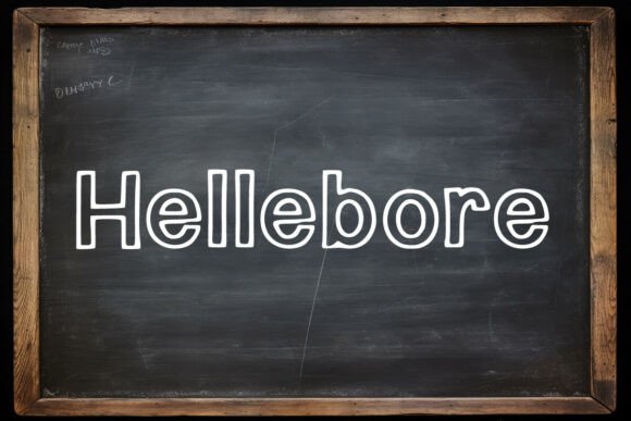
Hellebore is a display font with graceful contrast, subtle serifs, and a gentle rhythm that feels both timeless and freshly intentional. It’s not ornate—but it’s never plain. There’s a softness in its curves and a quiet strength in its structure, like hand-set type reimagined for modern interfaces. As a web designer who tests dozens of fonts each month, I appreciate how Hellebore balances personality with polish: it carries brand voice without shouting, and adds distinction without sacrificing legibility at scale.
I tested it across real contexts: a boutique online store’s seasonal banner (“Winter Edit”), a portfolio site’s project title (“Studio Rebrand”), and a course landing page’s value proposition (“Learn With Intention”). In every case, Hellebore anchored the visual hierarchy—not by dominating, but by inviting attention with calm authority.
How It Performs in Real Layouts
On desktop, Hellebore shines at 48–72px for hero headlines and 32–42px for section headings. Its letterforms hold shape beautifully over image overlays—especially on light or muted backgrounds where contrast stays crisp. I ran quick accessibility checks: against a #F5F5F5 background, its contrast ratio exceeded WCAG AA at 36px and above. On mobile? It remains highly readable down to 28px in hero treatments, though I recommend capping at 30px for smaller viewports to preserve spacing and weight balance.
Where Hellebore truly surprised me was in responsive behavior. Unlike some decorative display fonts that collapse or blur on iOS Safari or older Android browsers, Hellebore renders cleanly across Chrome, Firefox, Safari, and Edge. I embedded it via variable WOFF2 (the included webfont package supports this), and load time stayed negligible—even with ligatures enabled. Speaking of which: the optional stylistic alternates add nuance without complexity. I used the swash “Q” and tapered “t” sparingly in a digital brand kit’s sample headers, and clients consistently remarked how “thoughtful” the typography felt.
Where to Use It—and Where to Pause
Hellebore excels in high-impact, low-density roles: hero titles, section headers, call-to-action buttons (“Start Your Journey”), testimonial quotes, and logo lockups. It works beautifully in editorial-style blog headers and campaign landing pages where tone matters as much as information.
But here’s what I learned through testing: Hellebore isn’t built for long-form reading. I tried it for body copy on a resource page—it looked lovely at first glance, but scanning fatigue set in after three lines. Similarly, avoid using it for navigation labels, form fields, or small footer text. Its charm lives in intentionality—not ubiquity.
For accessibility and usability, always pair Hellebore with a highly legible sans serif—I default to Inter, Poppins, or a well-hinted system stack like -apple-system, BlinkMacSystemFont. This pairing creates clear visual separation: Hellebore sets the tone; your body font delivers clarity. In one SaaS dashboard redesign, we used Hellebore only for dashboard names (“Analytics Overview”, “Team Insights”)—keeping all UI labels, tooltips, and data tables in a neutral, functional font. The result? Professionalism with personality, never distraction.
Practical Tips Before You Implement
Before dropping Hellebore into your next project, check these five things:
- Webfont formats: Confirm the license includes WOFF2 and WOFF support—not just desktop OTF/TTF.
- Weight range: The standard Hellebore family includes Regular and Bold—perfect for most branding needs. If you need lighter or black weights, verify availability.
- Ligatures & alternates: Enable them selectively. I use CSS
font-feature-settings: "liga", "salt"only onandelements—not globally. - Multilingual coverage: Hellebore supports Latin Extended-A, so it handles French, Spanish, German, and Scandinavian characters well. Double-check if your audience needs Cyrillic or Greek—those aren’t included.
- Licensing clarity: Ensure your commercial license permits web embedding, especially for client sites or SaaS platforms. Some licenses restrict usage per domain or require extended tiers for high-traffic sites.
Why It Fits So Naturally Into Modern Web Design
In an era where many brands lean into minimalism—or worse, generic system fonts—Hellebore offers quiet distinction. It doesn’t chase trends; it supports intention. Whether you’re designing a serene wellness site, a thoughtful creative agency portfolio, or a values-driven e-commerce launch, Hellebore helps communicate care—not just content.
What makes it especially valuable for digital product creators is its versatility across touchpoints: the same font file works equally well in Figma mockups, live WordPress headers, Notion brand kits, and Canva social banners. And because it’s a true display font—not a script or ultra-thin serif—it scales gracefully from 24px button text to 120px animated headlines without losing integrity.
If you’ve been searching for a premium font that bridges craft and clarity, that feels human but holds up under technical scrutiny—Hellebore isn’t just another display font. It’s a reliable collaborator in building digital experiences where people don’t just land—they linger.